How Live Dashboards and Real-time Monitoring Drive Smart Decision-Making in M&E
- Aug 19, 2023
- 3 min read


Data is the heart of every research, study, or evaluation. Without the right data, we cannot evaluate any program's performance.
Real-time monitoring is essential to track progress and stay aligned with objectives. Going through hundreds of rows/columns manually is boring and time-consuming.
Why struggle with boring Excel files in this AI age?
Say bye-bye to old ways. Unchain yourself from the shackles of dreary and mundane manual processes and collect data quickly and with more authenticity than ever. The live dashboard has become a game-changing tool for monitoring and evaluation.
In this blog, we’ll talk about the dynamics and functionality of the dynamic dashboards that help you in informed decision-making. We’ll dive into designs, selection criteria, and the emphasis of Google Data Studio in dashboard making as a user-friendly and cost-effective solution.
The power of dashboards in M&E


The dashboard gives you a potential glimpse of key performance indicators (KPIs) and metrics that help you gain insights and make better decisions. They remove strenuous rapport analysis and empower social organizations to stay informed, track progress, and make informed choices.
Better monitoring and decision making
Gone are the times of turning endless pages, looking for facts through hundreds of rows and columns, and figuring out options. With a dynamic and intuitive dashboard, you can stay updated with real-time data and interactive charts that make navigation through an understanding of a survey easier.
A dashboard makes complex information appear simple and be easily inferred. Therefore helping decision-makers grasp the situation and make active decisions.
You get overall data insights
Dashboards help in improved decision-making. You can explore data from many perspectives and get a complete and detailed picture of organizational performance.
With interactive features like fillers and drill-downs, you get to understand indicators better, discover correlations, and identify areas to improve. You can adapt to new needs with a comprehensive approach.
Makes visualization look better
Who wants to keep looking for clues and ideas through monotonous numbers in a paper report? Dashboards come with well-crafted and thoughtful designs.
Key elements include selecting relevant KPIs, choosing engaging visualization types (e.g., line charts, bar graphs, pie charts), and maintaining a clean and user-friendly layout. With clear labels and intuitive color codes, decision-makers can make the right decisions fast.
Selecting the right dashboard platform
When you are thinking of developing your dashboard solution, you need to prioritize four factors:
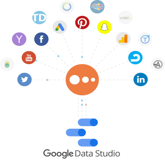
Image Credits: GoogleDataStudio
User-friendliness
Flexibility
Affordability
Ease of sharing
Considering the above factors, Google Data Studio (now Looker) is one of our preferred choices to make your dashboard beautiful and interactive.
Here are a few unique benefits of Looker (Google Data Studio) and why we recommend it.
One click integration with SurveyCTO platform
Cost-free solution with powerful features
Stunning visualizations and interactive dashboards.
Seamless integration with other Google products.
User-friendly interface.
Real-time collaboration with team members.
Connects to various data sources for comprehensive insights.
Easy sharing and publishing of dashboards.
Customize visualizations to match the brand's style.
Mobile-friendly designs.
Looker (Google Data Studio) charts is an add-on


Google Data Studio gives you a scope to make your chart visually appealing. You can choose among many chart types, from line charts to track trends, bar graphs to compare performance, pie charts to represent proportions, and more, as shown here.
The wrap
Embrace technology and make the most of your data. A dynamic and intuitive dashboard is not only work efficient but visually attractive to work with.
Use an interactive dashboard, simplify data analysis, holistically understand your monitoring and evaluation, and bring a meaningful impact and positive change.